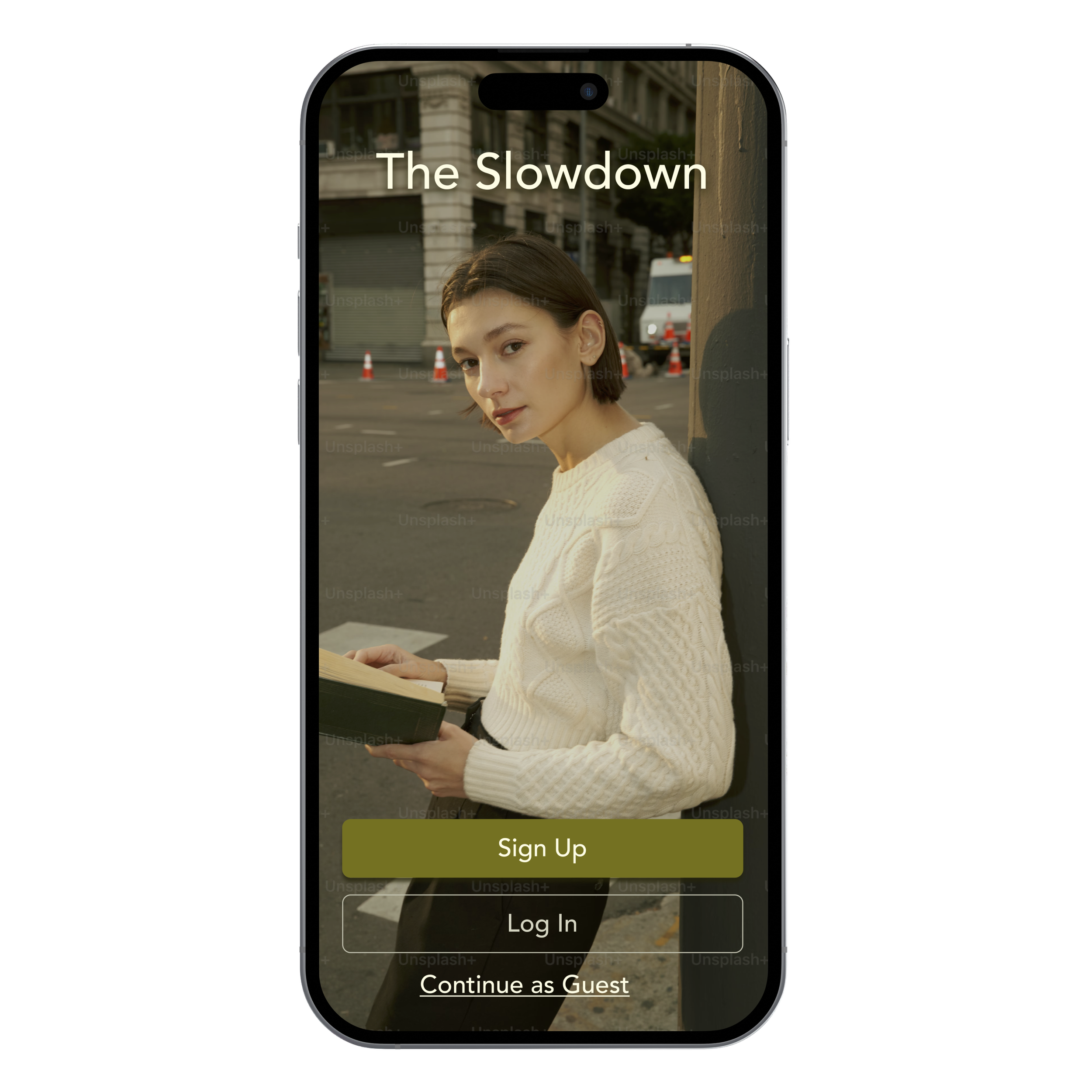
The Slowdown

Problem
Users struggle to find stylish, sustainable fashion options due to unclear brand practices, misleading claims, and overwhelming choices.
Overview
I designed a platform that simplifies and enhances sustainable shopping, educating users on ethical fashion choices, and making sustainable shopping accessible, stylish, and enjoyable
How might we make sustainable fashion more accessible, stylish, and transparent for users????
Solution
The Slowdown is a sleek, editorial-style platform that combines curated shopping with educational content. Users can discover sustainable brands, learn about their practices, and shop curated picks effortlessly.
The design balances transparency and user-friendly navigation to make ethical shopping enjoyable and accessible.
UX/UI CASE STUDY
Role:
Sole UX/UI Designer & Researcher
Tools Used:
Figma, Marvel, Zoom
Goal:
Create an intuitive platform that helps users discover and shop sustainable brands.
User Insights:
Users are frustrated by greenwashing and misleading claims.
Transparency about brand practices is crucial.
Stylish, sustainable options feel limited and overwhelming to explore.
Research Methods:
Conducted user interviews with 5 participants aged 25-60.
Performed competitive analysis of sustainable fashion platforms.
-

"It’s hard to trust brands these days that claim to be sustainable. How do I really know?"
Marley H.
-

"Well known sustainable brands are pretty generic. I wouldn't consider them fashion-forward.
Cady H.
-

"I want to feel good about my purchases…but I won't spend hours researching brand ethics."
Chris R.
-

"Finding (sustainable) clothing that is cute and not overpriced is impossible."
Lauren F.
User Personas:
After analyzing the insights from user interviews, I created clear, relatable personas to humanize the data and better understand the diverse needs, frustrations, and motivations of the users.
The Conscious Shopper
A young, urban professional who values style and sustainability but wants affordable options and clear brand information.

The Quality Shopper
A professional who prioritizes high-quality, ethically made fashion and seeks trustworthy brand details.

The Traditional Shopper
A mature shopper interested in sustainability but often overwhelmed by limited choices and fit issues.

Design Process:
The imagery and design choices for The Slowdown are designed to shift the narrative, because sustainable fashion should feel just as aspirational and exciting as shopping for any non-sustainable goods.
Mood Board:
This mood board reflects that ethos by blending effortlessly chic, vintage-inspired moments with modern elegance, proving that ethical fashion can still be luxurious and desirable. Every element, from curated second-hand pieces to bold, captivating colors, puts the focus on sustainability without compromising style.

Early Ideation:
Based on the insights from user research and personas, I explored several design directions that would address users’ need for transparency, style, and convenience.
Initial sketches explored intuitive navigation systems and simplified ways of labeling sustainable practices to reduce decision fatigue.
User Flows:
Using the insights from my user personas, I defined key user flows to address their specific needs and behaviors. I focused on creating a seamless experience for users like Chloe, Michael, and Margot.
For Chloe, the key flow centers around quickly discovering trendy, sustainable brands from the homepage, while Margot’s flow emphasizes product research and verification of brand credentials before purchasing. Michael’s flow ensures ease in accessing curated recommendations based on his style preferences.

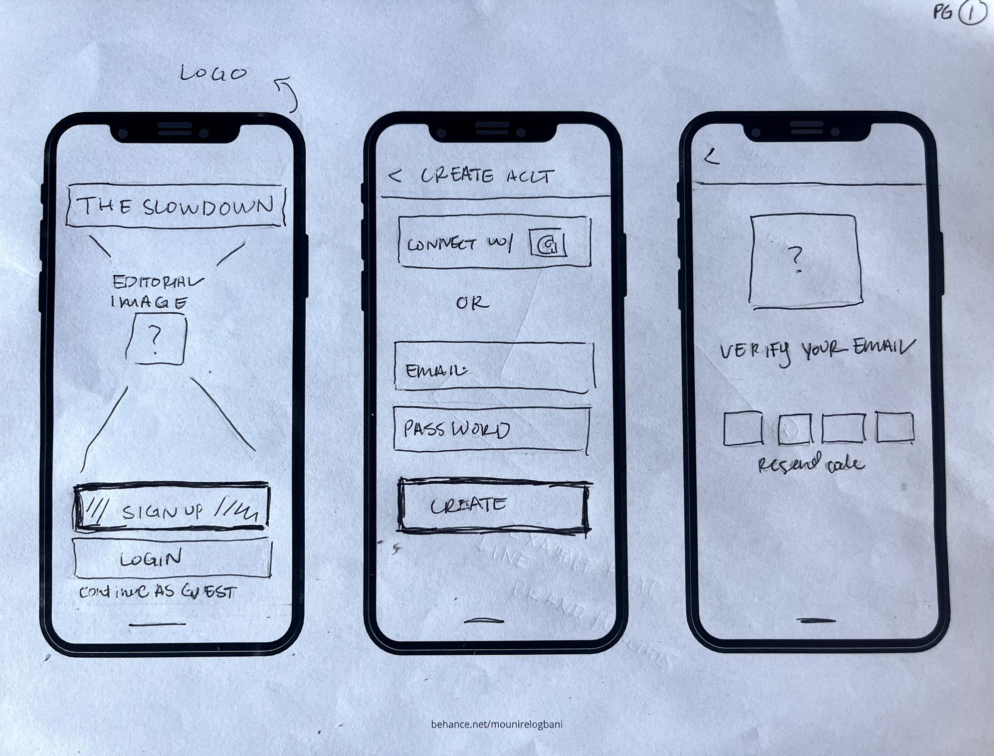
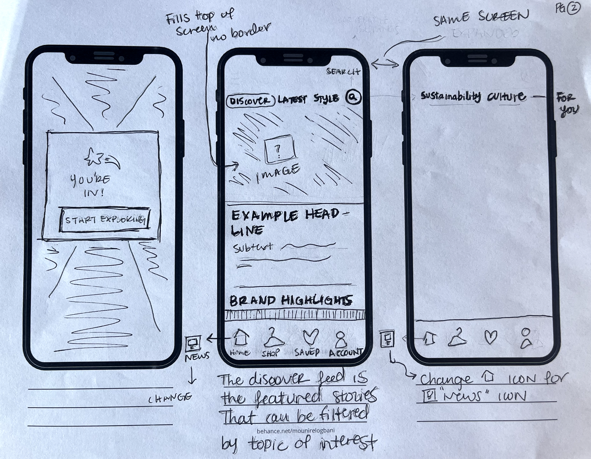
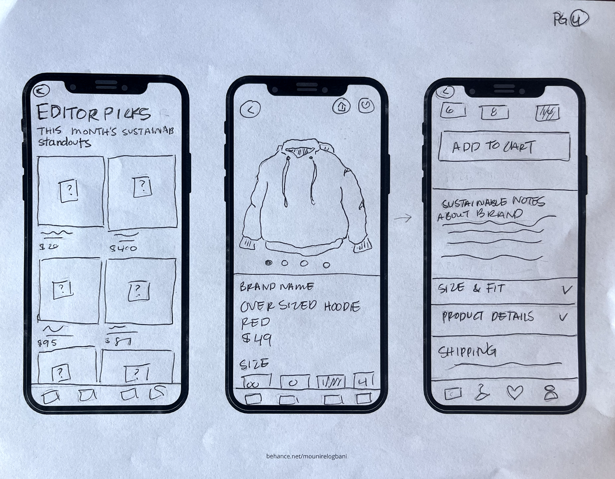
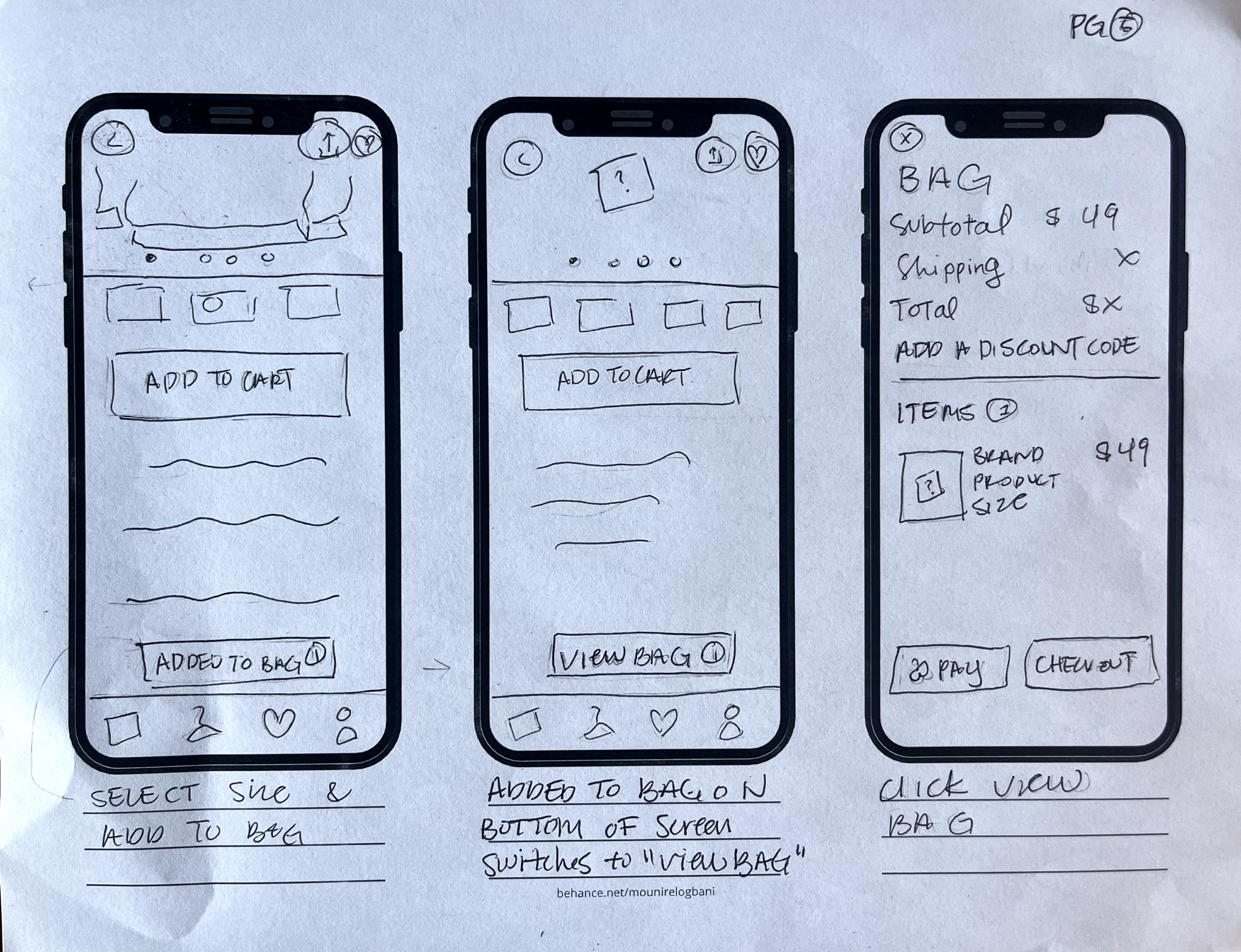
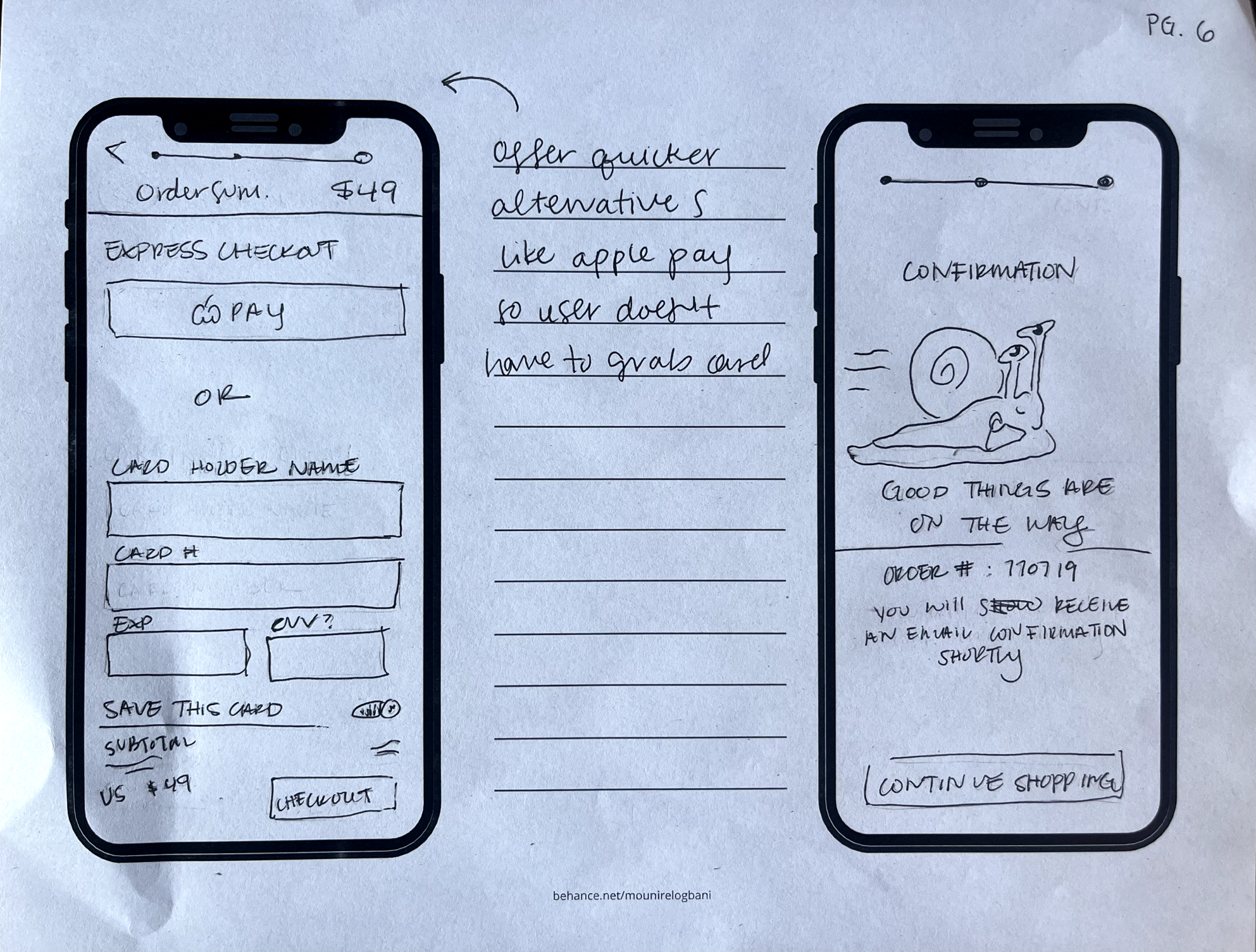
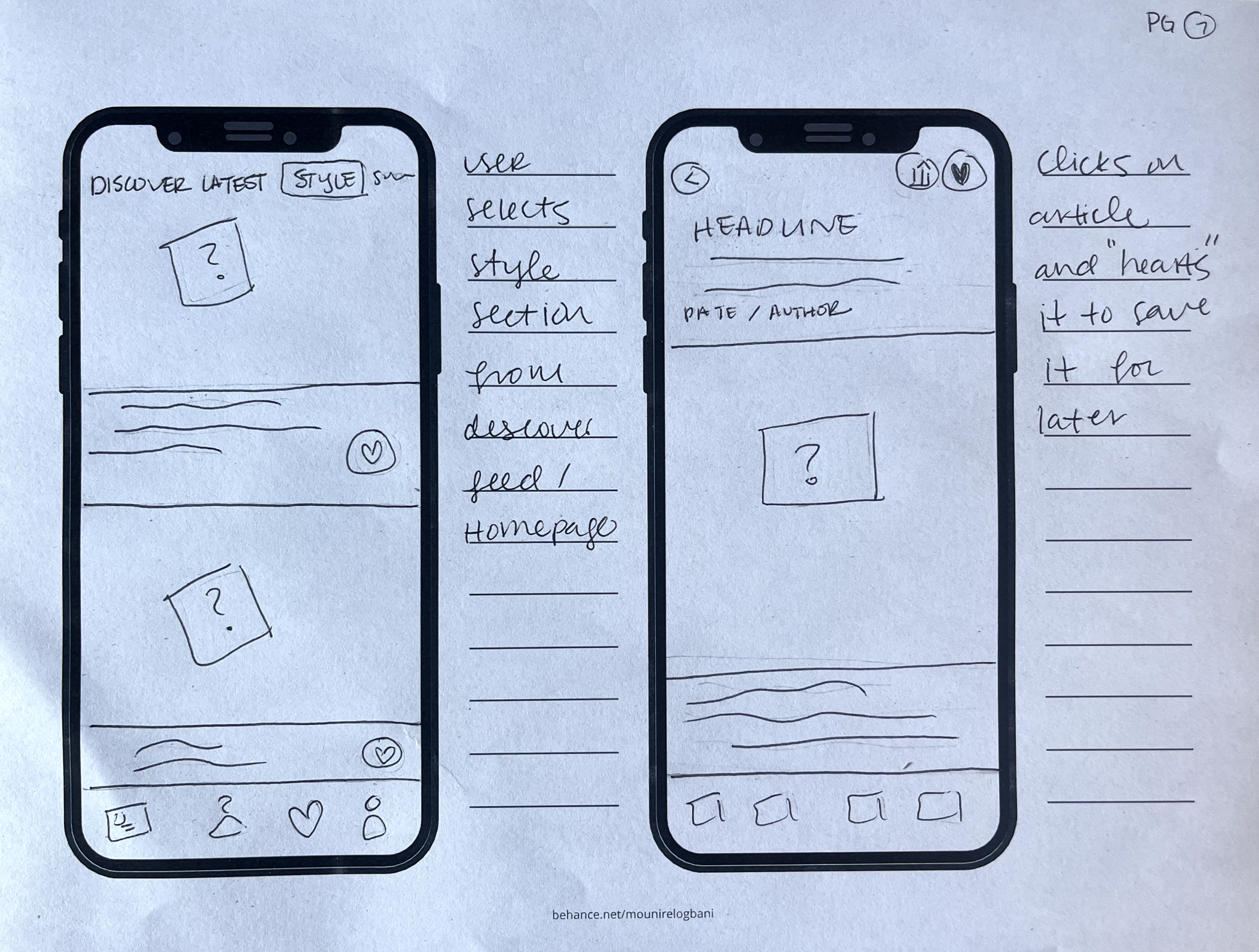
Wireframes:
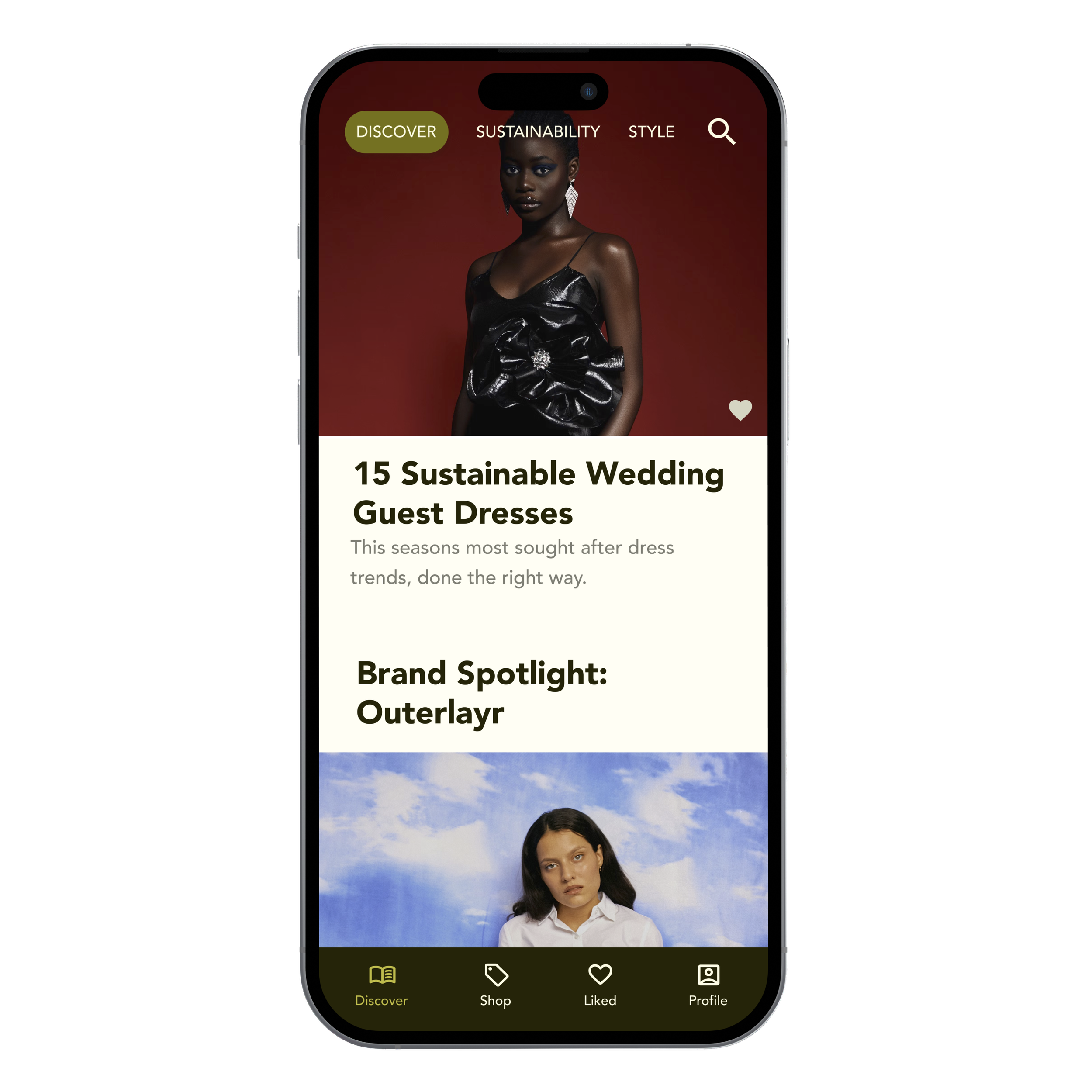
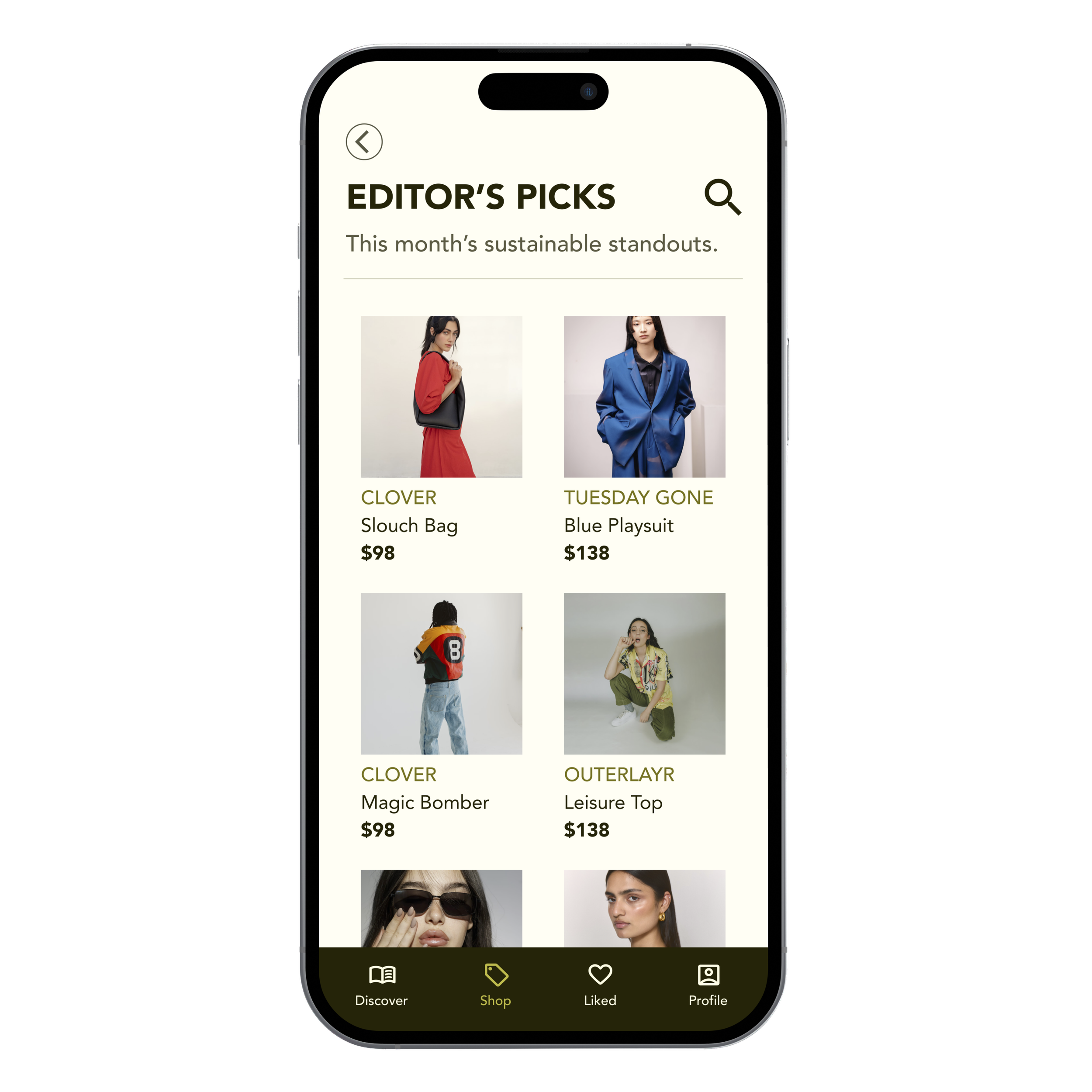
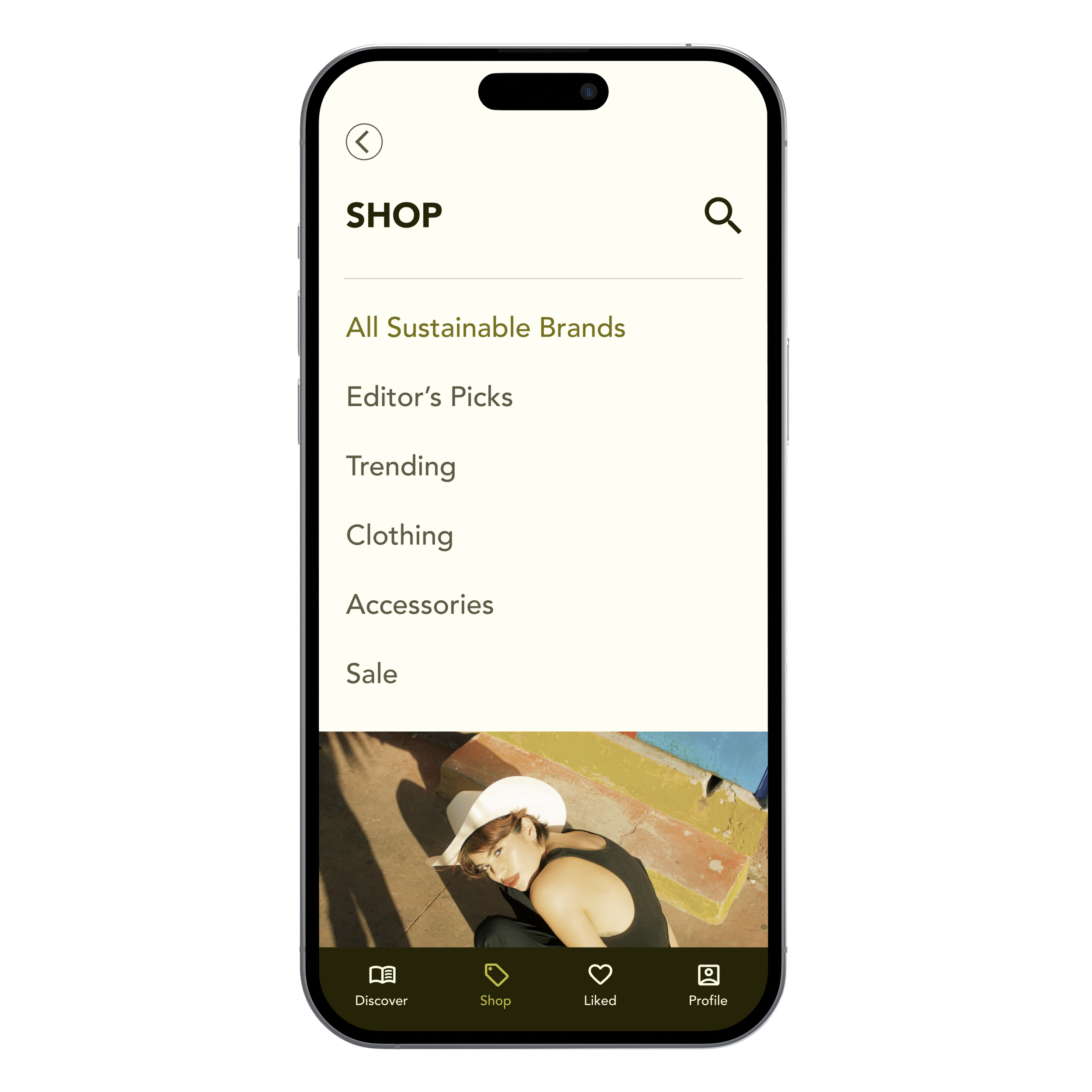
These early wireframes showcase key features that align with user needs and research insights. The Home/Discover Feed introduces users to fresh content, curated picks, and sustainable brands, providing a seamless entry point into the platform.
All the features are designed to enhance user engagement by offering transparency, personalized recommendations, and the ability to save favorite items.
I used sketching as an opportunity to test one of the app's key use cases: presenting the sustainable brand story and product details in a clear and digestible format


Lo-Fi Mockups:
Moving into Lo-Fi mockups, I focused on organizing content and interaction elements to maintain the platform's sleek, editorial feel while ensuring easy navigation. This stage helped clarify how users would explore sustainable brands, read fashion articles, and shop curated picks, aligning the design with The Slowdown's vision of being both aesthetically engaging and user-friendly
Scenario 1:
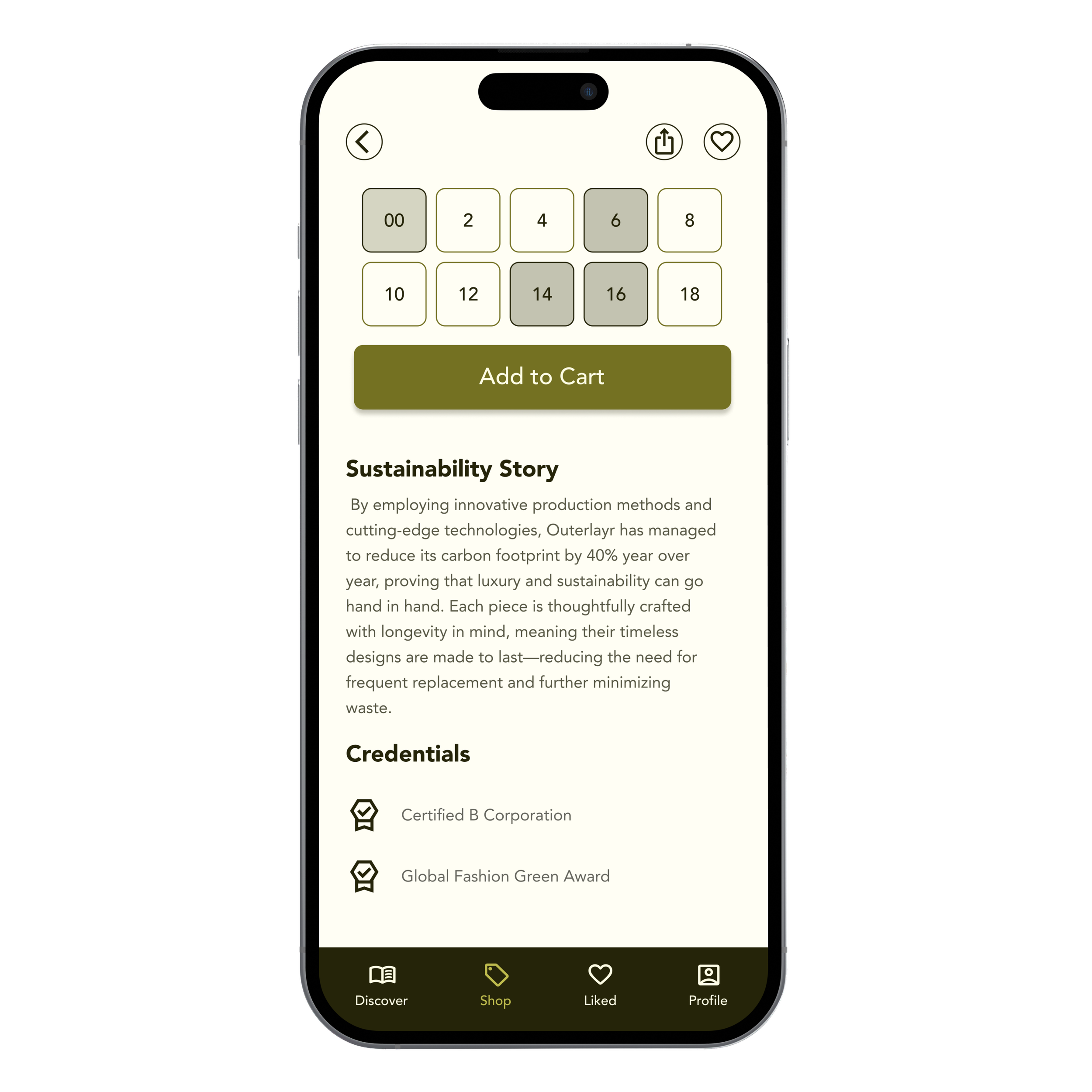
Users were previously frustrated by hidden or unclear sustainability credentials in existing apps. Here, the sustainability story and credentials are displayed prominently, directly addressing this pain point.
Scenario 2:
Many users mentioned feeling overwhelmed by misleading claims. The app resolves this with clear labeling of trusted articles, helping them quickly discover reliable, in-depth content on fashion trends.
Scenario 3:
By consolidating saved products, articles, and brands into one cohesive tab, users can easily revisit their research without having to navigate through multiple sections.


Usability Tests:
Test 1:
Testers highlighted some confusion around accessing key features like the discover feed and sustainable brand stories. Based on these insights, I refined the navigation structure, making it more intuitive and ensuring users could effortlessly explore the platform.
Test 2:
For Usability Test 2, the focus was on validating the changes made from the first round. Testers responded positively to the improved navigation, finding it easier to locate features like editor’s picks and the liking heart function. Minor adjustments were made to further streamline the user experience based on this round of feedback.
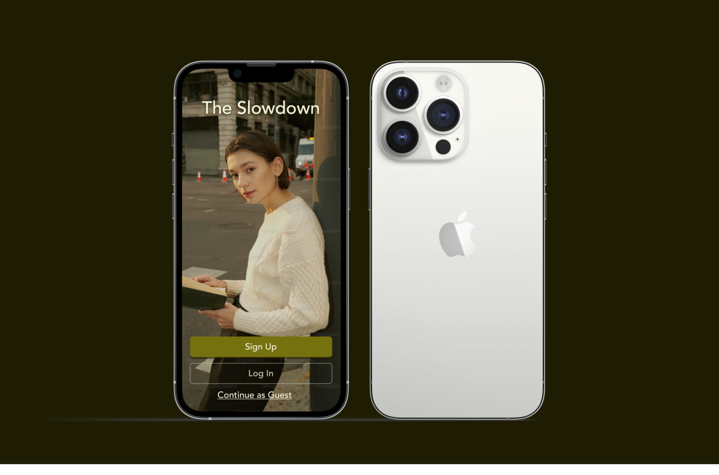
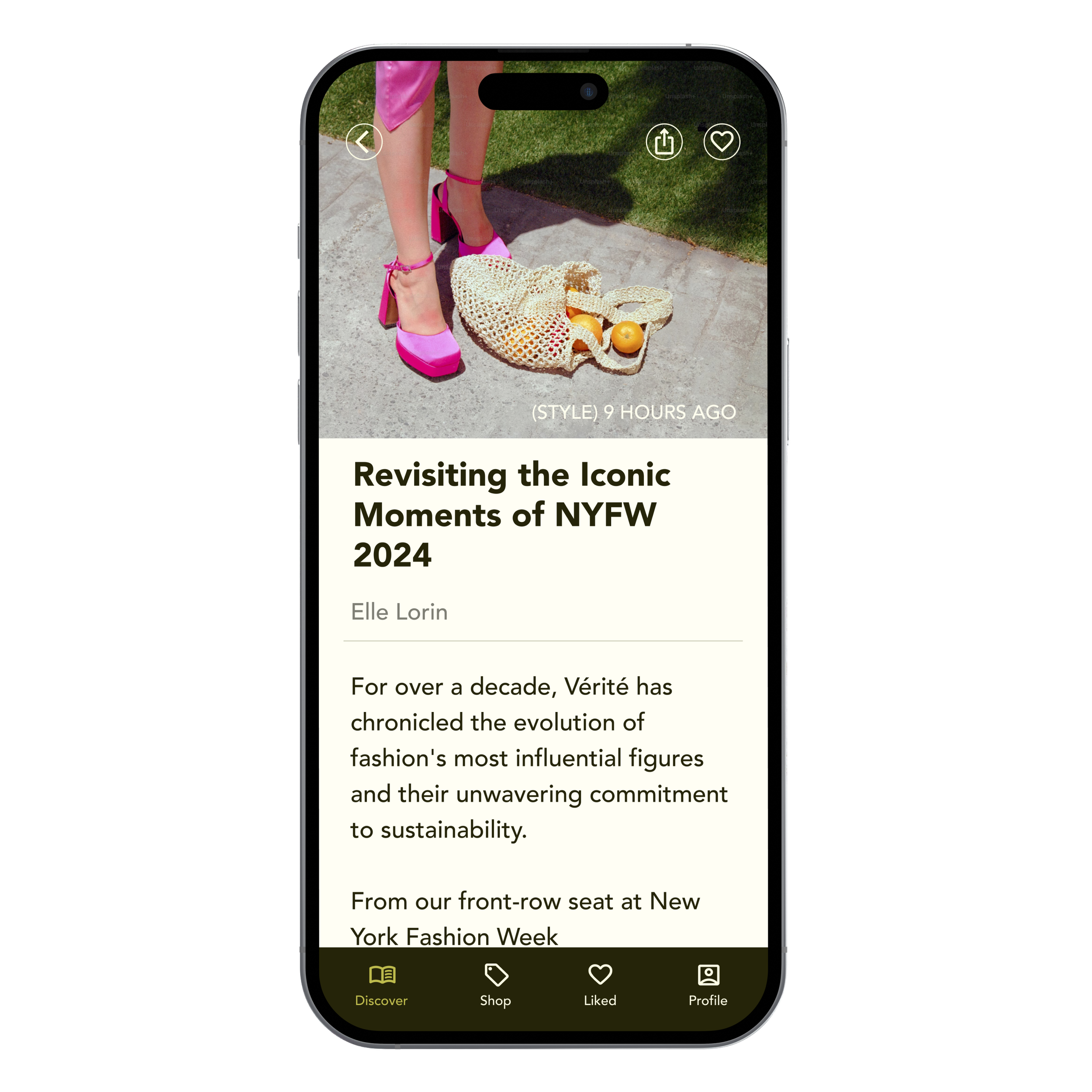
Final Design:
In my final hi-fi mockups for The Slowdown, I chose a sleek, minimalist aesthetic to reflect the brand's identity: honest, sophisticated, and edgy. The color palette leans into soft neutrals paired with bold olive accent, striking a balance between modernity and elegance. This decision was intentional, ensuring the platform felt like a high-end fashion magazine while still maintaining an approachable vibe.
For typography, I selected Avenir, a clean, geometric sans-serif font, which embodies both sophistication and clarity. Its modern look complements the brand’s edgy yet polished tone, making it perfect for readability across headlines and body text without overwhelming the visuals.
Conclusion:
The Slowdown successfully bridges the gap between fashion-forward trends and ethical shopping practices, offering users a sleek, intuitive platform to discover sustainable brands. Throughout the design process, usability testing and user feedback were critical in shaping the final product, ensuring it met both functional and aesthetic goals.
Reflecting on this journey, I’ve learned the importance of iterative design and user-centered decision-making, which ultimately helped create a polished, impactful experience for our audience.