Cine.

Problem
Many movie lovers want to deepen their understanding of filmmaking but lack access to cohesive, engaging, and affordable educational resources. Current platforms fail to integrate education and entertainment effectively, leaving users without a clear path to explore storytelling, techniques, and cinema history.
Overview
I designed a platform that blends film discovery with bite-sized educational content, transforming the movie-watching experience into a learning journey.
How might we encourage users to upgrade from the free to paid version of the Cine app?
Solution
Cine blends curated film discovery with educational content, offering both free and premium experiences. Free users can explore recommended movies and educational commentary, while premium subscribers unlock exclusive workshops, behind-the-scenes insights, and interactive lessons designed to feel like a virtual film school.
UX/UI CASE STUDY
Role:
Sole UX/UI Designer & Researcher
Tools Used:
Figma, Marvel, Zoom
Goal:
Revolutionize film education for movie lovers, and convert free users to premium subscribers by offering a seamless upgrade experience and compelling educational features.
User Insights:
Users seek bite-sized, engaging lessons rather than long-form courses.
A combination of entertainment and education increases user retention.
Clear value communication is crucial for converting free users to paid subscribers.
Design Process:
Challenges:
Balancing entertainment and education.
Creating a compelling free-to-paid journey.
User Flows:
To ensure a seamless user experience, I designed user flows that focused on key actions, such as signing up, discovering content, and upgrading to premium. These flows prioritized simplicity and clarity, guiding users toward premium features without interrupting their exploration.

Signup Flow: Introduced premium features early, highlighting their value during account creation.
Content Discovery Flow: Made curated recommendations easily accessible, with clear calls-to-action for unlocking premium content.
Upgrade Flow: Ensured that transitioning from free to paid membership felt intuitive and rewarding.
Research Methods:
Conducted interviews with 8 participants aged 18–24.
Performed competitive analysis on platforms like MasterClass, Letterboxd, and The Criterion Channel.
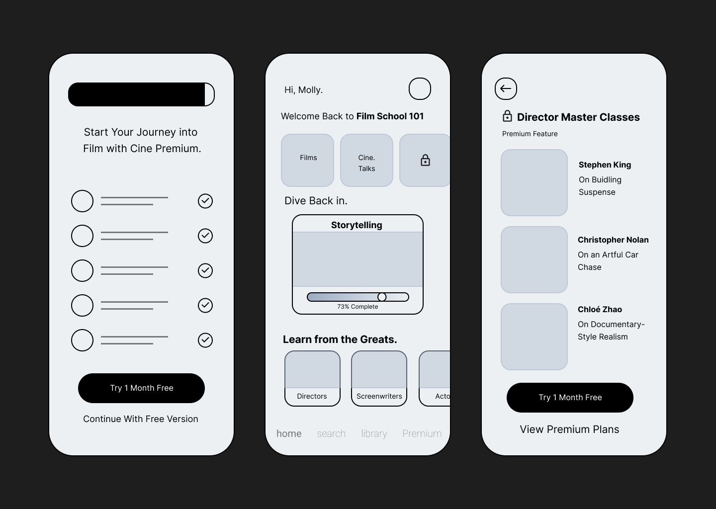
Wireframes:
These low-fidelity mockups helped outline the structure and functionality of key screens, such as:
Splash and Signup Screens: Capturing user attention while communicating the value of Cine’s premium features.
Library Screen: Organizing content into categories like "Award Winners" and "Critic’s Choice," with prominent upgrade prompts.
Premium Features Page: Highlighting exclusive benefits in a visually engaging manner to encourage subscriptions.
Solutions:
Free Features: Curated movie recommendations and commentary.
Premium Features: Exclusive workshops, interviews, and interactive film school modules.


Visual Design:
Brand Attributes:
Hip
Bold
Smart
Color Palette:

Typography:

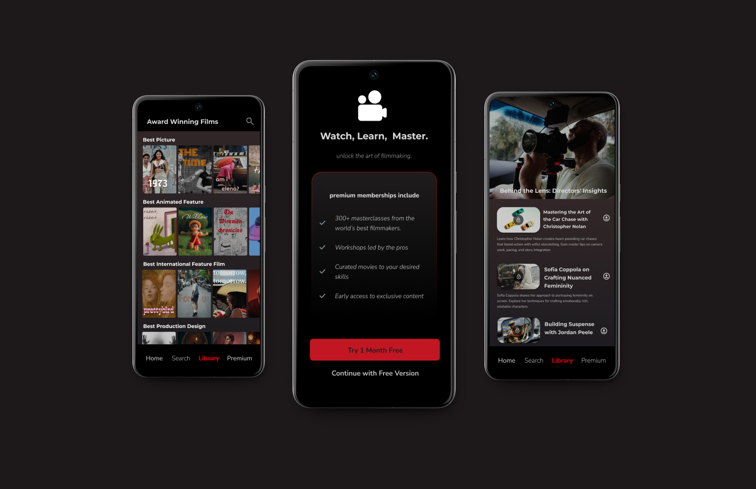
Hi-Fi Screens:


Splash Screen: A bold, cinematic introduction.
Premium Page: With a clear value proposition
Library: Organized with categories like "Award Winners" and "Critic’s Choice."
Premium Masterclass Categories: A preview into what is accessible to premium subscribers


Premium Content: A title card and description of the exclusive Master Classes, offering users an enticing preview of the content they’ll unlock with access.
Pricing: A broken down look at the pricing structure, with an option to try free for a month.


Usability Testing:
Method:
Remote testing with 5 participants.
Feedback:
Users praised the cinematic aesthetic and intuitive navigation.
Suggested adding video previews for films.
Wanted clearer communication of premium benefits.
Changes Implemented:
Added realistic movie titles and posters to create a more authentic, immersive experience, helping users visualize how they would interact with the app as if it were a live product.
Enhanced the visual hierarchy on the premium screen by decluttering text and focusing on the core benefits, making the information more digestible and appealing.
Results:
Key Achievements
Successfully balanced education and entertainment in a cohesive user experience.
Created a realistic, immersive app that effectively communicated premium benefits and inspired users to upgrade for exclusive access.
Designed a scalable app that aligns seamlessly with business goals, supporting future growth and user retention.
Lessons Learned:
Early feedback is essential for refining design decisions and ensuring user needs are met.
Clearly communicating the app’s value during user testing is crucial to understanding how users perceive benefits versus initial assumptions.
Clear value communication remains a critical factor for converting free users into paid subscribers.
Click here for the Cine Prototype →
Conclusions:
Through this project, I successfully designed an app that bridges the gap between entertainment and education, providing movie lovers with a platform to explore, learn, and engage with cinema on a deeper level. Cine’s design effectively communicates the value of premium features while remaining accessible and engaging for free users.