Savr

Problem
Users find Savr’s recipe app overwhelming due to unclear instructions and a lack of helpful visual cues. Key struggles include:
Complex instructions causing users to lose focus.
Missing progress indicators.
Frustrations switching between ingredients and instructions.
Overview
Savr is a recipe app I re-designed over the course of five days for my Springboard Design Sprint.
Following Google Ventures Design Sprint framework, the goal was to simplify the cooking process and address user frustrations with Savr’s existing interface.
Design Sprint Timeline
Day 1: Understand & Define the Problem
Day 2: Ideation & Sketching Solutions
Day 3: Decide on the Solution
Day 4: Build the Hi-Fi Prototype
Day 5: Test & Validate the Prototype
How might we provide visual and interactive guidance to enhance clarity and reduce mistakes in the kitchen?
Solution
An interface that simplifies the cooking experience by offering step-by-step guidance, visual progress indicators, and intuitive features like Cook Mode and ingredient pop-ups to reduce chaos and build user confidence in the kitchen.
UX/UI CASE STUDY
Role:
Sole UX/UI Designer & Researcher
Tools Used:
Figma, Marvel, Zoom
Goal
Create a clear, organized recipe-following experience to reduce frustration and prepare users for smooth cooking. The goal was to balance clarity with challenge, making the process enjoyable and efficient.
Insights:
Research revealed that users:
Appreciate recipes but find unclear instructions stressful.
Want feedback and visual progress indicators.
Seek step-by-step clarity to build confidence.
Research Methods:
User Interviews: Spoke with 5 participants to uncover frustrations and needs in recipe apps.
Competitive Analysis: Reviewed recipe apps to identify usability gaps.
Lightning Demos: Analyzed tools for inspiration on clear, interactive design solutions.
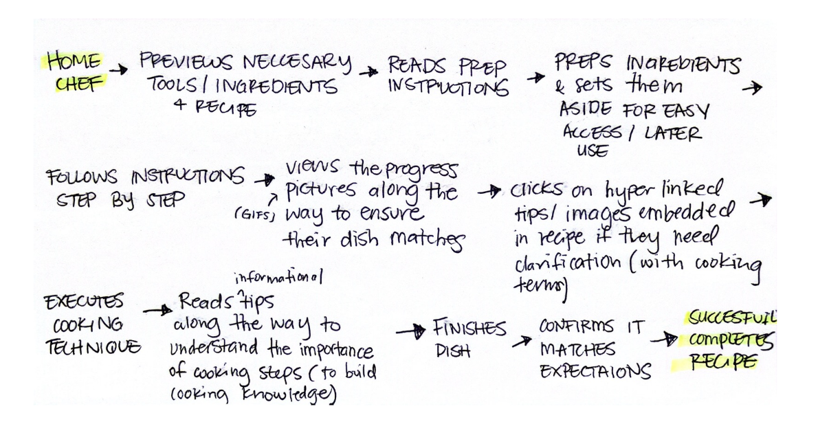
Visualizing the Problem:
To understand the user journey, I created a flow map. My goals being:
Focus on clarity, ensuring users feel confident.
Balance experience, reducing stress while enhancing enjoyment.
Lightning Demos:
During Day 2 of the design sprint, I analyzed several recipe apps and cooking solutions to draw inspiration for Savr. This inspired features like:
Progress indicators
GIFs and videos in steps
Cook Mode for hands-free interaction
Ingredient pop-ups
Linked tips and techniques
Crazy 8’s Brainstorm:
Using the Crazy 8’s brainstorming method, I identified essential features:
Distraction-free cooking mode
Visual cues with embedded videos/GIFs
Floating ingredient pop-ups

Deciding on a Solution:
I sketched key screens focusing on:
Recipe Overview with Time and Rating
Step-by-Step Cooking Mode with Embedded Videos
Ingredient Quick-Access Pop-ups
Wireframe storyboard:
The design rationale included:
Helping users assess recipe suitability with clear overviews.
Reducing anxiety with visual aids and embedded instructions.
Streamlining navigation with quick-access ingredient tools.

Final Design:
The hi-fi prototype incorporated:
Modern, minimal interface
Bold typography and orange accents
Editorial-style imagery
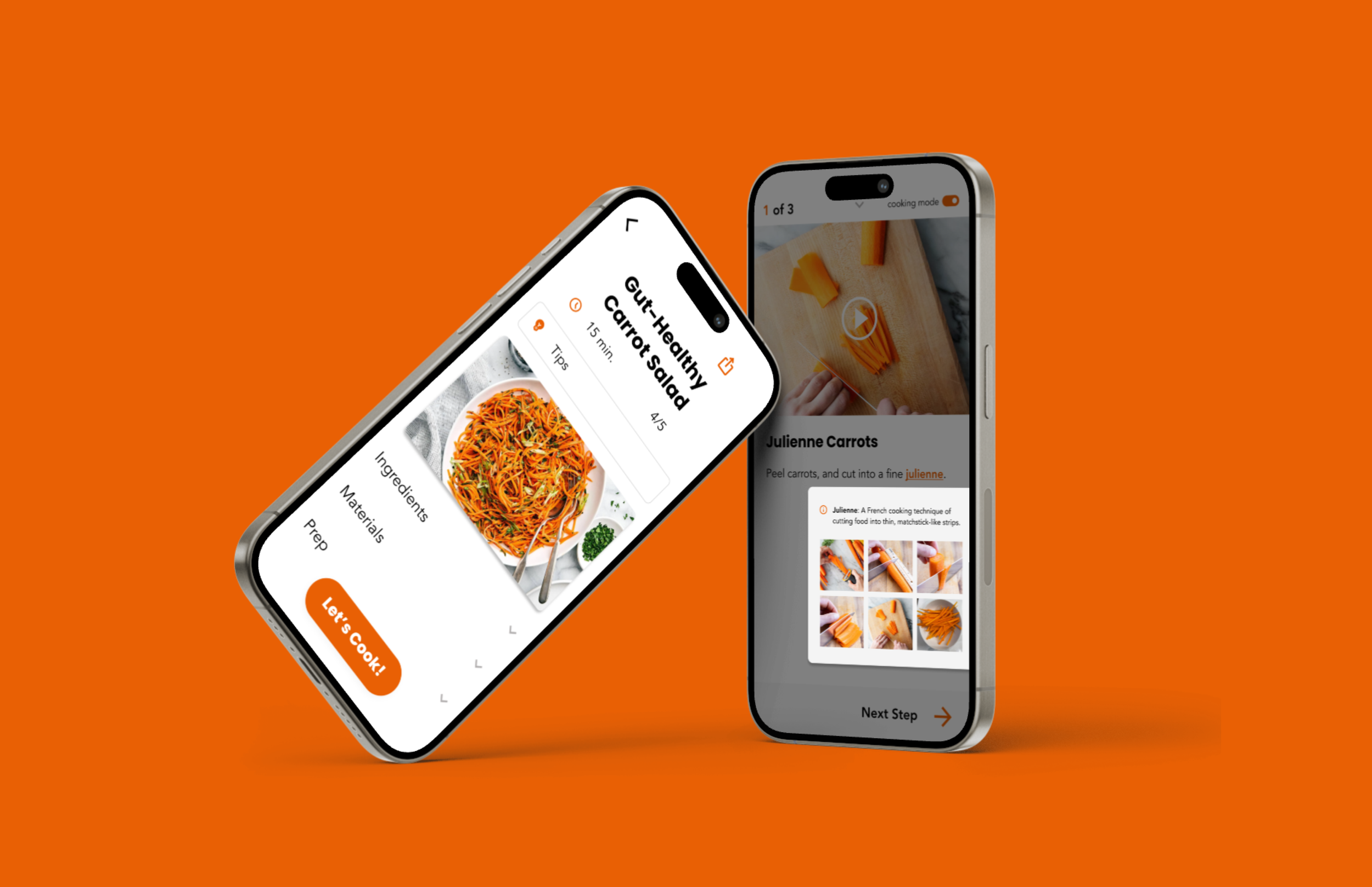
Hi-Fi Screens:


Collapsible Menus: Provides detailed information without overwhelming the screen.
Tips: User-recommended insights to reduce confusion and improve recipe success.
Time: Clearly labeled time estimation.


Cooking Term Definition: Quickly defines unfamiliar terms for clarity.
Video Tutorial: Offers looping videos for step-by-step guidance.
Cooking Mode: Streamlined, hands-free interface for easy recipe navigation while cooking.
Ingredient Pop-up: Instant access to ingredient details without disrupting the flow.


Finish & Keep Exploring: Slide down to exit, share the recipe, or return to browsing seamlessly.
Usability Testing:
Method:
Remote testing with 5 participants.
Feedback:
Users loved the Cooking Mode toggle.
Instructional videos reduced anxiety.
Suggested improvements on the Share Recipe button visibility and ingredient access.
Changes Implemented:
Enhanced the Share & Ingredients button by increasing its size and contrast for improved visibility and usability.
Reflection:
What Worked Well: Focused sprint structure, validated design decisions.
Challenges: Balancing speed and quality in tight timeframes.
Moving Forward:
Incorporating user feedback earlier and iterating in stages will ensure impactful and user-centered designs. This approach strengthens clarity, enjoyment, and confidence in the cooking process.